
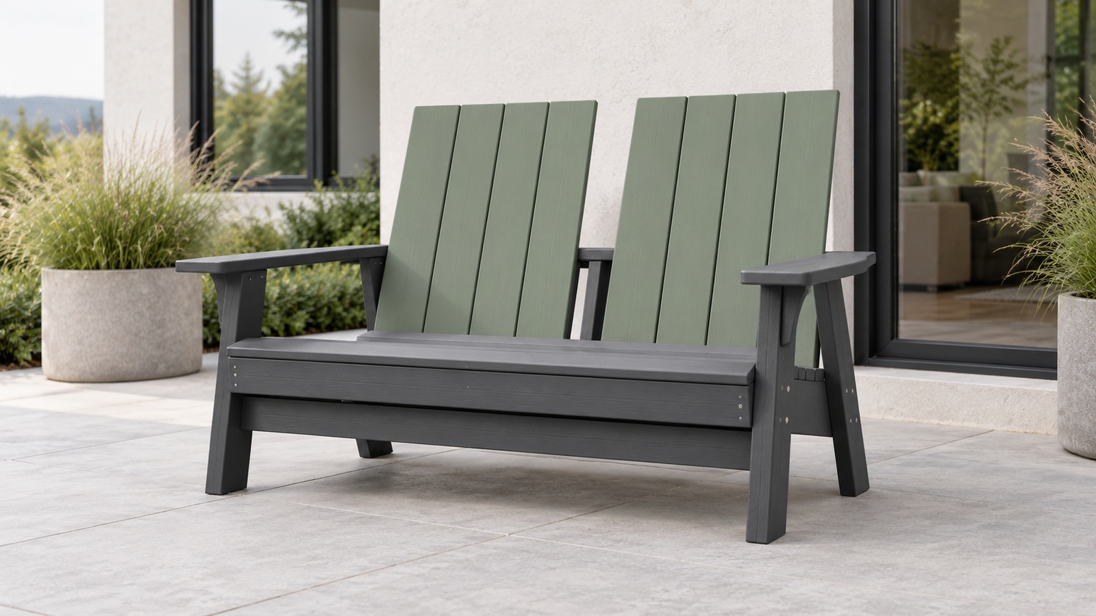
Use Two Colors to Connect the Seat and the House
A two-tone double Adirondack can make a patio feel considered without requiring every outdoor object to match. One color can connect the loveseat to window frames, decking, or other permanent materials, while the second introduces personality through the broad back or arms. Because a shared seat occupies more visual space than a single chair, the placement of those colors matters as much as the palette itself. A fashionable combination becomes more useful when it suits the home’s light, the garden’s background, and the way people gather around the furniture. Begin with a clear role for each color, then test the contrast and the complete seating arrangement. The result should feel like a deliberate part of the home, with enough flexibility to remain appealing as smaller accessories change.
A: Choose one lasting architectural reference near the seat, then assign a distinct role to the second color.
A: No. Judge the color placement on the actual model and the views that matter in your setting.
A: Yes, though their distinction should be assessed in the site's ordinary light and shade.
A: The paired backs and broad structure can increase the visible area and impact of the contrasting surfaces.
A: No. Repeating one related tone can connect the group without duplicating every detail.
A: Use suitable textiles and smaller companions to shift the mood around the fixed palette.
A: Compare the pair beside the house and patio at ordinary times of day, with any planned textile swatch.
A: No. Verify the construction, finish, and care information for the offered product.
A: They can change its visual presence, but its measured footprint and access needs stay important.
A: Connect it to a lasting home feature and a color you enjoy, then leave smaller accessories flexible.
Assign a Different Job to Each Color
Two-tone styling works best when the colors are doing identifiable work. A darker frame can connect the loveseat to metal railings or window trim, while a lighter back draws attention to the place where people sit. Alternatively, a neutral body can support colored arms as a smaller accent. Think about which surfaces will be most visible from the garden and from inside the house. The palette should be judged on the three-dimensional chair rather than on two rectangles placed together.
Decide whether the seat should be a focal point or a connecting piece. A focal loveseat can carry more contrast because it is meant to catch the eye. A connecting piece may use closely related colors that bridge different existing materials. Both approaches can look current, but they create different compositions. Choosing the intended role first makes it easier to resist a combination that is attractive in isolation but awkward in the actual patio.
Start with One Permanent Architectural Reference
Look for an existing element you expect to keep: a dark window frame, a pale wall, a warm deck, or a stone terrace. Borrowing a related tone can make the furniture feel associated with the house without copying every material. Compare samples in the same light. A charcoal that looks neutral indoors may read cooler beside warm brick, while an off-white can change noticeably against a bright wall.
A single architectural reference is usually enough to start. Trying to match the roof, trim, paving, fence, and garden ornaments simultaneously can produce a palette with no clear center. Choose the reference that is most visible near the seat. Let other elements remain part of the background. This gives the loveseat a reason to belong without requiring the entire property to become a coordinated set.
Use the second color to shape the mood you want. Muted green can relate to planting, warm clay can echo an earthy setting, and a restrained blue can add a cooler note. These are design possibilities rather than rules about what a modern house must use. The best choice depends on the surrounding materials and your preference. Test it outdoors before deciding that a fashionable name describes the right color for your home.
Read Contrast across the Loveseat’s Large Surfaces
A double back creates a broad field, so a high-contrast color split can be much stronger than it appears on a small single-chair image. Consider the amount of each color as well as its intensity. Pale arms on a dark body create a different effect from pale backs on a dark frame. Ask for an image or sample configuration that matches the actual model. A similar palette on another chair does not show how your loveseat will distribute the colors.
Low contrast can be just as deliberate. Two related grays, a warm neutral paired with a muted brown, or nearby green tones can emphasize form while keeping the seat quiet. Look for enough distinction to make the two-tone choice visible where you want it. If the colors merge in the site’s shade, the combination may feel more like a single tone. That can be acceptable, but it should be an intentional outcome.
High contrast brings attention to connections and outlines. It can make arms, repeated slats, or a center feature stand out sharply. Decide whether those are details you want to emphasize. A busy construction with many small color changes may compete with planting or nearby furniture. Simpler placement often reads more clearly across a garden view.
Review the chair from several ordinary viewing positions. The entrance view may show its back, while the living-room window shows the front and a path reveals one side. Color placement can work differently from each angle. A palette that looks balanced head-on may leave one end visually dominant. Use the complete shape to judge the composition rather than choosing solely from a showroom front view.
Take the color distribution into account when the loveseat is empty as well as when cushions are fitted. A large textile can conceal one tone and leave the other much more dominant. Keep a clear view of both arrangements before choosing the palette. The furniture should still look intentional during ordinary accessory cleaning or storage. This helps the two-tone scheme remain a property of the chair rather than depend entirely on a staged set of cushions.
Test the Actual Samples Outdoors
Place finish or material samples beside the patio surface and house at different times of day. View them in both the intended light and the shade that occurs there regularly. Screen images, catalog printing, and indoor displays provide useful introductions, but they cannot reproduce your site’s exact conditions. Keep the samples together so the relationship is visible, and include a cushion swatch only if that accessory is part of the plan. The practical test is whether the colors still feel right when the garden supplies the background.
Keep Nearby Furniture from Competing
A two-tone loveseat can establish a palette without requiring every companion to repeat both colors. A table might use the frame color, while another seat remains a quiet neutral. This gives the group continuity and avoids making the contrast feel mechanically repeated. Compare the whole arrangement from a distance. The pieces should have a relationship while retaining clear individual purposes.
Limit additional accent colors until the main pair is settled. Planters, cushions, umbrellas, and decorative objects can quickly turn a controlled composition into several competing statements. Temporarily reduce the surrounding objects if the loveseat feels harder to read than expected. Add back what contributes to comfort or the intended mood. A simpler arrangement can make the furniture’s color choice more effective.
Scale matters alongside palette. A tiny side table may look unrelated to a broad shared seat even when the colors match exactly. Compare usable reach, height, and the physical space around the group. Color coordination should support a practical arrangement. It cannot solve an object whose proportions or placement make it difficult to use.
Leave Soft Furnishings Some Flexibility
Cushions and throws can connect the two colors without introducing a third dominant field. A simple neutral may leave the back panels visible, while a restrained pattern can repeat a small amount of the accent. Choose accessories appropriate for the chair and intended outdoor use. Review their separate care instructions and the effect of cushion thickness on sitting fit. The look should remain comfortable as a complete arrangement.
Keep some flexibility for seasonal changes. If the fixed furniture already carries strong contrast, an accessory does not need to repeat the same intensity. A lighter textile in summer or a warmer neutral later can shift the mood while preserving the main palette. Store and care for accessories through their own guidance. Treat those changes as styling options rather than reasons to keep adding objects around the seat.
Verify the Product Behind the Color Choice
Two-tone can describe factory-selected plastic-lumber components, a coated wood product, or another construction entirely. Find out which material and finish are being offered and what care they require. A palette option does not identify how the furniture is built. Read the complete model information before comparing long-term upkeep. This is especially useful when similar-looking products have different surfaces and assembly details.
Confirm which surfaces can actually be specified in each color. Some makers offer a fixed body-and-accent arrangement rather than unlimited placement. Ask whether the product image matches the configuration you are ordering. Keep the color names and component assignment in the purchase record. That helps avoid receiving a combination whose proportions differ from the one you imagined.
If the plan involves changing the finish of an existing chair, use a process appropriate for that product and surface. Do not assume every plastic or coated component accepts an added paint system. Obtain compatibility and preparation guidance before starting. A two-tone idea is a decorative goal, not evidence that a particular alteration is supported. Factory options may be a simpler route when the product is designed to provide them.
Check ordinary seating requirements independently from styling. The double chair needs to suit both users, its stated capacity, the location, and the route into the garden. Compare complete dimensions and the practical access around the seat. A color combination can make a large object look visually lighter without making its footprint smaller. Keep physical fit visible throughout the selection.
Make the Loveseat Part of a Clear Gathering Area
A trendy appearance becomes more convincing when the furniture looks ready for use. Orient the loveseat toward a view or a conversation partner, and arrange useful surfaces where they can be reached appropriately. Avoid treating the paired seat as a decorative object pressed against a wall with no room around it. Check the whole layout with its actual dimensions. A deliberate gathering area gives the color scheme a practical setting.
Consider how the shared seat relates to other users. Two people on one loveseat may prefer a different conversation angle from two independent chairs. A table or another seat can help complete the group without creating a rigid symmetrical display. Test the arrangement in ordinary use when possible. The patio should feel welcoming from the positions people actually occupy.
Leave suitable movement paths through the area. The wide arms and reclined back can project farther than a casual glance suggests, and a companion footrest changes the outline again. Review entry and exit as well as the view. A composed palette looks better when the setting feels unforced. Practical room around the chair supports that sense of ease.
Choose a Combination You Can Keep Enjoying
Trendy need not mean a short-lived commitment. A useful two-tone scheme connects one lasting feature of the home with a second color you enjoy, while leaving accessories free to change. Keep the main color placement simple enough to understand from several views. Favor samples and product information over a passing impression from a small image. Those decisions give the purchase a foundation beyond the moment’s fashionable palette.
After the seating is in place, review what the two colors are accomplishing. If the loveseat belongs to the architecture, stands out at the right strength, and works comfortably for two, the scheme is doing its job. Adjust small companions before assuming the fixed palette needs to change. A thoughtful two-tone double Adirondack can bring a current look to the patio while remaining a practical, familiar place to gather.


